
3 vs 6 Color Palette Generator: Create the Perfect Color Scheme
Compare 3 vs. 6 color palette generators, learn color harmony rules, accessibility tips, and how to create professional palettes for any project.
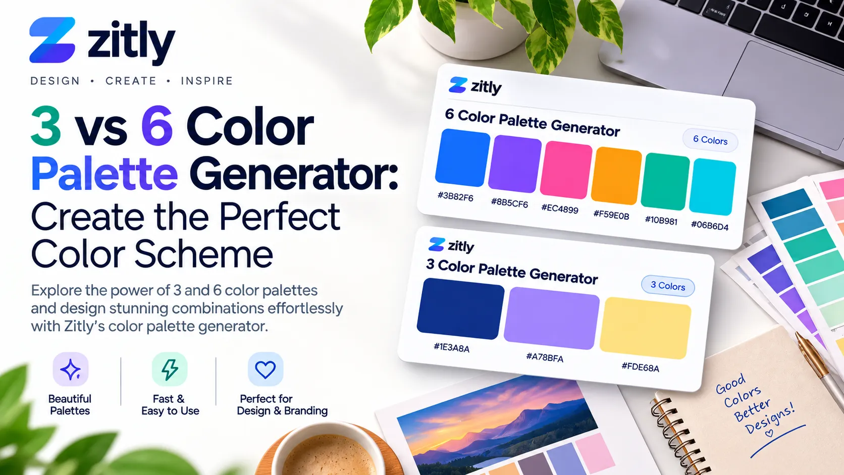
A 3-color palette generator produces three harmonious colors, usually a dominant, a secondary, and an accent, using a color wheel rule. A 6-color palette generator extends that base with light and dark neutrals plus a status color, giving designers a complete system for websites, apps, and brand guides.
What Is a Color Palette Generator?
A color palette generator creates matching colors from a starting point. You supply a base color, an image, or a harmony rule, and the generator calculates companions using hue, saturation, and lightness math. Most tools output hex, RGB, and HSL values you can paste straight into design software or stylesheets.
The number of colors controls complexity. Three colors give you clarity. Six colors give you range. Choosing between them is the first decision in any visual project.
3 Color Palette Generator: How It Works
A 3-color palette generator selects a base hue, then places two partners on the color wheel according to a rule. Because only three values exist, the output is easy to apply and hard to misuse.
The 60 30 10 Rule
Designers give about 60 percent of a layout to the dominant color, 30 percent to the secondary color, and 10 percent to the accent. This proportion keeps pages balanced and pulls attention toward calls to action.
Best Uses
Landing pages and single-purpose microsites
Logos, social profile graphics, and slide decks
Email templates where simple styling renders reliably
Printed materials with limited ink budgets
6 Color Palette Generator: How It Works
A 6-color palette generator produces a wider system. It usually combines three brand hues with supporting neutrals and a functional color, then balances lightness steps so every color has a clear job.
The Six Roles
Primary: the main brand color for buttons and headers.
Secondary: supports navigation, icons, and charts.
Accent: highlights offers and key actions.
Light neutral: page backgrounds and cards.
Dark neutral: body text and borders.
Status color: errors, warnings, or success messages.
Best Uses
Websites and web applications with forms and dashboards
Design systems shared by several teams
Data visualization that needs distinct categories
Brand guidelines covering print and digital
3 Color vs 6 Color Comparison
Factor | 3 Color Palette | 6 Color Palette |
|---|---|---|
Complexity | Low | Medium |
Setup time | Minutes | Under an hour |
Flexibility | Limited | High |
Best for | Logos and landing pages | Apps and design systems |
Accessibility control | Basic contrast checks | Full text, background, and status pairing |
Main risk | Looks flat on large products | Looks busy without discipline |
Color Harmony Rules Behind Every Generator
Every generator runs on a few harmony models. Knowing them lets you steer results instead of accepting random output.
Rule | Wheel Position | Mood | Best Fit |
|---|---|---|---|
Monochromatic | One hue, varied lightness | Calm and cohesive | Minimal brands |
Analogous | Neighboring hues | Natural and soothing | Wellness and lifestyle |
Complementary | Opposite hues | Bold and energetic | Sales and sports |
Split complementary | Base plus two neighbors of its opposite | Balanced contrast | Beginners wanting contrast |
Triadic | Three evenly spaced hues | Playful and vibrant | Education and kids |
How to Use a Palette Generator Step by Step
Define the goal. Decide whether the project needs a quick identity (3 colors) or a full system (6 colors).
Choose a base color. Start from a brand color, a logo, or an emotion you want to express.
Select a harmony rule. Pick complementary for contrast or analogous for calm.
Generate and lock. Lock colors you like and regenerate the rest until the set feels right.
Check contrast. Test text and background pairs against WCAG ratios.
Preview in context. Apply the palette to a real page mockup, not only swatches.
Export values. Save hex, RGB, and HSL codes, then document each color role.
Accessibility and Contrast Requirements
WCAG 2.1 contrast guidance asks for a ratio of at least 4.5 to 1 for normal text and 3 to 1 for large text. Interface components and charts need 3 to 1 under a separate criterion. An attractive palette that fails these ratios excludes readers and weakens conversions. Color vision deficiency is common, and men are affected more often than women, so never rely on color alone to carry meaning. Pair color with labels or icons.
Ready-to-Use Sample Palettes
These original palettes use hex values you can apply freely. Test contrast before publishing.
3 Color Palette | Dominant | Secondary | Accent |
|---|---|---|---|
Ocean Ledger | #0B2545 | #13A89E | #F4B942 |
Forest Clay | #2F4B3A | #C8643C | #F2E8D5 |
6 Color Palette | Primary | Secondary | Accent | Light | Dark | Status |
|---|---|---|---|---|---|---|
Studio Harbor | #0B2545 | #13A89E | #F4B942 | #F5F7FA | #5C6B7A | #D64545 |
Garden Market | #264D3B | #7BAE7F | #E9A23B | #FAF6EE | #3D3A36 | #B3402F |
Choosing the Right Generator Tool
Popular options include Adobe Color, Coolors, and Paletton. You can also try the free Zitly color palette generator, which builds palettes from a hex color, a photo, or a name, lets you choose the palette size, and checks every color against WCAG contrast. Whatever you pick, look for these features:
Color locking so you keep what works
A built-in contrast checker
Export to CSS, SVG, or image formats
Color blindness simulation
Image extraction for brand photos
Hex, RGB, HSL, and CMYK output
Best Palette Type by Industry
Industry | Recommended | Reason |
|---|---|---|
Fintech and RegTech | 6 color | Dashboards need status colors for alerts, approvals, and risk levels. |
Local services | 3 color | A simple identity stays consistent across signs, flyers, and profiles. |
Ecommerce | 6 color | Product cards, sale badges, and checkout states need separate roles. |
Personal blogs | 3 color | Fewer colors keep reading comfortable and templates fast. |
Software as a service | 6 color | Complex interfaces rely on layered neutrals and feedback colors. |
Expert Tips for Better Palettes
Start with the neutral. Pick your light and dark neutrals first, because they cover most of the screen.
Tint, do not add. Create extra shades by changing the lightness of existing hues instead of introducing new colors.
Reserve the accent. Use it only for the single action you want visitors to take.
Test in dark mode. A palette that works on white can fail on a dark background.
Review on real devices. Phone screens, laptops, and printers each render color differently.
Exporting Palettes to Design and Code Tools
A palette only helps when the whole team can reach it. Save each color as a named style in your design tool, using role names such as primary, accent, and surface rather than color names such as blue. In code, store the same values as CSS custom properties or inside your framework theme file, so one change updates every page. When a palette also needs smooth transitions, turn two of its colors into a background with a CSS gradient generator. Share the hex, RGB, and HSL values in a single reference page, and add the contrast pairs you already approved. This habit prevents drift between designers, developers, and content teams, and it keeps future updates fast and predictable.
Common Mistakes to Avoid
Equal color weights. Without a dominant color, layouts feel chaotic.
Ignoring contrast. Light text on pastel backgrounds fails readers.
Overusing the accent. It loses power when it appears everywhere.
Skipping neutrals. Six saturated colors produce harsh, tiring pages.
Trusting screen colors for print. Convert and proof in CMYK first.
Skipping documentation. Teams drift without a written palette guide.
Copyright and Licensing Notes
Under United States Copyright Office practice, simple color changes and familiar color combinations are generally not copyrightable, which makes generated palettes safe for most projects. Laws differ by country, and a distinctive color tied to a trademark, or a palette copied from a protected artwork, can still raise issues. Build from your own base values, review the terms of your chosen tool, and consult a qualified professional for brand registration questions.
Conclusion
A 3-color palette generator gives you speed and focus, while a 6-color palette generator gives you range and control. Start with three colors when the project is small, then expand to six when buttons, text, backgrounds, and alerts need clear roles. Whichever path you take, apply a harmony rule, respect the 60 30 10 balance, verify contrast, and document every hex value. That discipline turns a quickly generated result into a lasting visual system. You can test any palette idea right now with the free design tools on Zitly.
Frequently Asked Questions
Q: What is a 3-color palette generator?
It is a tool that creates three matching colors, typically dominant, secondary, and accent, using a color wheel rule.
Q: What is a 6-color palette generator?
It outputs six coordinated colors, including neutrals and a status color, for complete brand or interface systems.
Q: Which is better, a 3-color or 6-color palette?
Neither wins universally. Choose three for simple identities and six for products that need hierarchy, text, and feedback colors.
Q: Are generated palettes free to use?
Generally yes, because colors are not usually copyrighted. Still read the tool terms and avoid copying trademarked brand colors.
Q: How do I make a palette accessible?
Test text and background pairs for 4.5: 1 contrast, avoid color-only meaning, and preview with color blindness filters.
Q: What is the 60 30 10 rule?
It is a layout guide that assigns 60 percent to a dominant color, 30 percent to a secondary color, and 10 percent to an accent.
Q: Can I generate a palette from a photo?
Yes. Most tools extract dominant colors from an uploaded image, which suits brand photography and product shots.
Q: Which color format should I save?
Save six-digit hex codes for web use, plus RGB and CMYK values for screen and print production.
Q: How many colors should a website use?
Most sites perform well with three to six core colors plus tints and shades of those colors.
Q: Do colors affect conversions?
Contrast and clarity change how easily visitors find buttons and read offers, so a thoughtful palette supports conversion goals.

Fahad Ahmad
Founder of ZITLY · Digital Entrepreneur · SEO & SaaS Specialist
Fahad Ahmad is the founder of ZITLY and a digital entrepreneur with over 10 years of experience in SEO, digital marketing, SaaS development, and web technologies. He specializes in creating practical online tools that help marketers, designers, developers, and business owners work more efficiently.
Through ZITLY, Fahad publishes tutorials, tool comparisons, productivity resources, and research-driven guides focused on simplifying digital workflows and improving online performance.
Related Articles
View all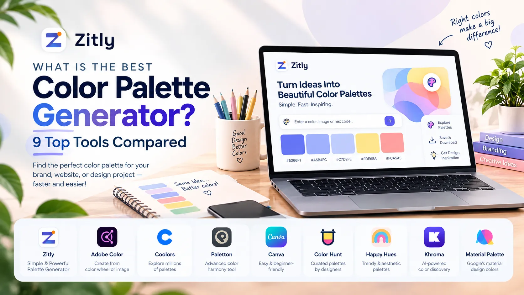
Find the best color palette generator for your project. Compare free, AI, and photo tools, then follow a simple workflow to build a palette that works.

Learn how to create a QR code for free, choose static or dynamic codes, customize it, test it, and keep it working for years.
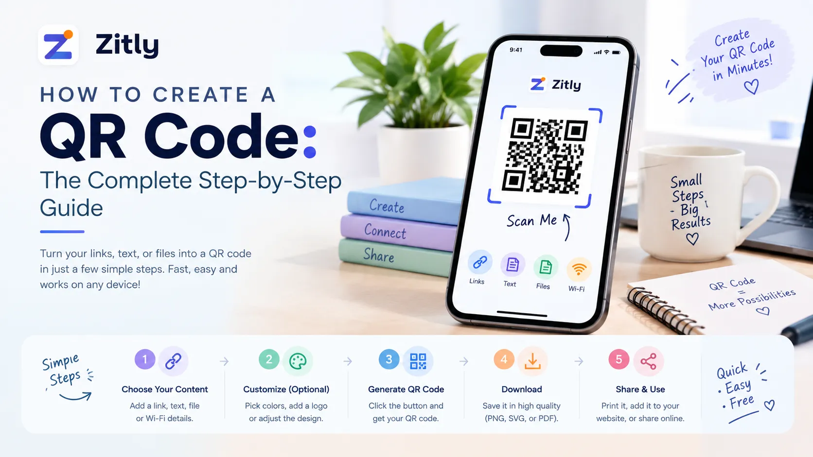
Learn how to create a QR code in minutes. Compare static vs. dynamic codes, follow the steps, avoid common design mistakes, and test before you print.